
 "QUANTUM SHOT" #315
Link
Welcome our contributing writer Constantine vonHoffman of "Collateral Damage" - "Today's sarcasm is tomorrow's news". Constantine is sometime journalist, alleged humorist, award-winning science fiction writer and social media maven for Spoke.com.
Naval fleets once were the largest painting canvases in the world.
War has inspired many great artistic moments but how often have artists returned the favor? Once, as far as I can tell. During World War I Modernism descended on Allied naval planners with a bang (sorry about that), turning fleets into the largest painting canvases in the world.
(image credit: gotouring)
(image credit: lightshipvisual)
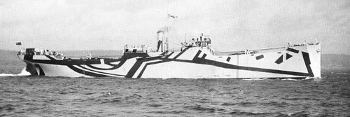
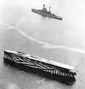
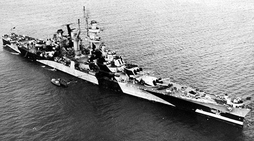
HMS "Argus", a World War 1 early aircraft carrier:
(image credit: bobolinkbooks)
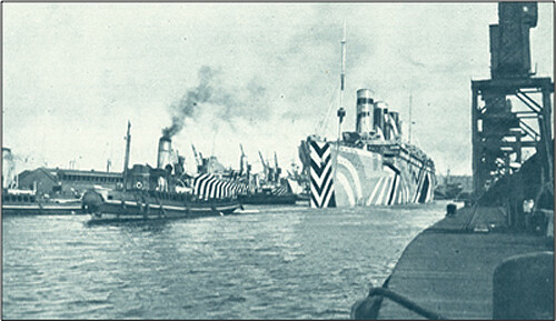
Like most of us, The Allies only turned to modern art out of desperation. German U-boats were sinking enormous amounts of shipping and there was no really effective defense against them. It is axiomatic that if you can't stop the people who are shooting at you, you should make it very hard for them to find you. Thus, camouflage.
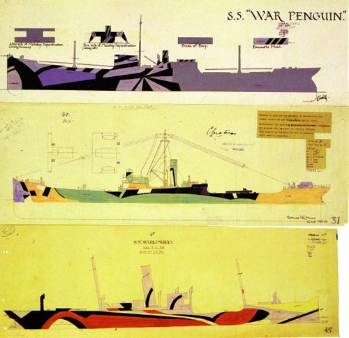
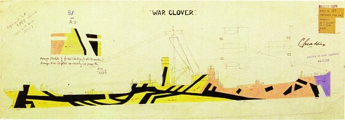
"War Clover" in color drawing, with a colorized version by Aidan Hall:
(images credit: Jim and Jamie Richter)
(As hard as it may be to believe, camouflage was still a radical idea in military circles at the outset of WWI. At the start of the war, four Zouave regiments of the French Army were outfitted in bright blue jackets and red pants. Neither this uniform nor the men wearing them lasted very long.)
(image credit: Imperial War Museum)
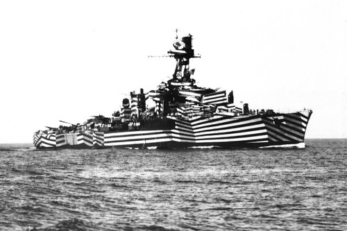
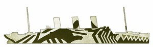
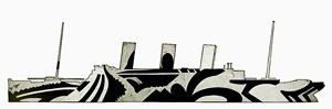
Most camouflage is based on the idea of concealment and blending in with its surroundings. However another school of thought has argued for making the item in question appear to be a mashup of unrelated components. Naval camoufleurs found this theory particularly appealing. Blending didn't work because ships operated in two different and constantly changing color environments – sea and sky. Any camo that concealed in one environment was usually spectacularly conspicuous in others.
Hard to tell where the ship is heading
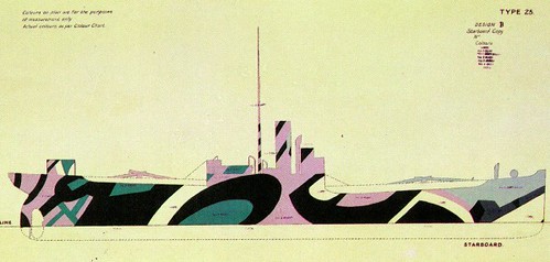
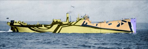
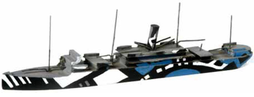
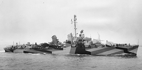
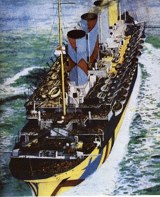
Norman Wilkinson, a British naval officer and painter, suggested a scheme that came to be known as Dazzle or Razzle Dazzle painting. Wilkinson believed that breaking up a ship's silhouette with brightly contrasting geometric designs would make it harder for U-boat captains to determine the ship's course.
SS "Argylshire":

The French cruiser "Gloire":
(image credit: Jim and Jamie Richter)
The SS "Melita":
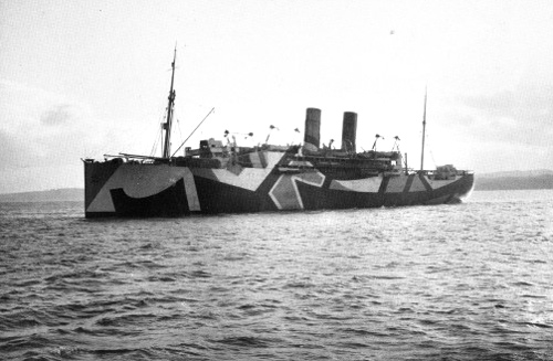
(image credit: Jim and Jamie Richter)
USS "Mahomet":
(images credit: Jim and Jamie Richter)
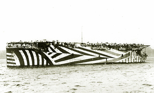
USS "Leviathan":

(images credit: history.navy.mil)
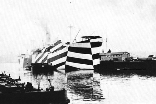
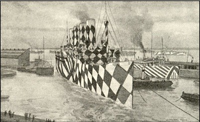
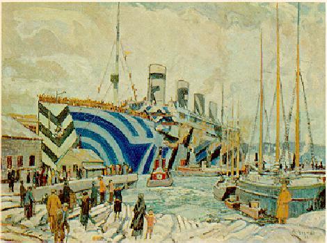
Passenger liners join the gallery
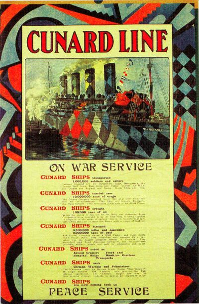
Even passenger liners were camouflaged in the similar radical way. HMS "Mauritania", apparently inspired by Pagliacci:

(artist Burnett Poole, 1919)
You can paint, but you can't hide
How well did it work? How well do most artistic theories work when they confront the real world? While there was a marked decrease in losses to U-boats après Dazzle, historians agree that this reduction was mainly due to the adoption of the convoy system at the same time. Dazzle did, however, boost the morale of allied seamen as well as capture the imagination of artists and the public alike.
Had the Allies been fighting art history majors or Academy painters there is little doubt they would have been stunned into submission by the sheer audacity of the color schemes. The only way these designs would have confused the U-boat captains was if the sky and sea had been created by Mondrian or Duchamp.
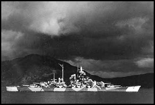
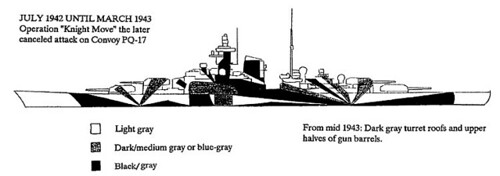
While full color Razzle Dazzle never really succeeded, its easy to see its impact in later successful camouflage. The German Navy tossed out the garish color schemes and used geometric painting in black, white and gray during World War II. Other navies continue to use variations on this to this day.
The German battleship "Tirpitz"
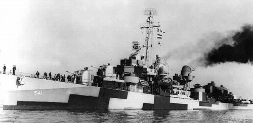
DD-541, The Destroyer "Yarnall":
US Navy cruiser "Alaska":
USS "Charles S. Sperry"
(image credit: John Prolly)
Here is an example of the Russian ship camouflage:
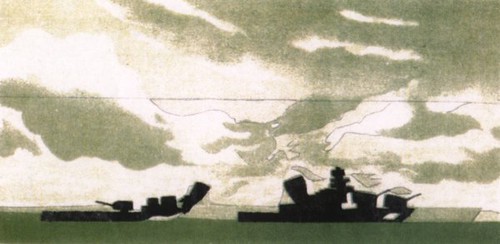
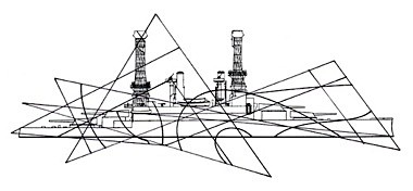
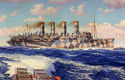
Artistic versions of Razzle-Dazzle paint schemes
Unfortunately there are no known color photographs of these ships. Contemporary accounts describe them as every bit as breath-taking as one would imagine them to be. It is fitting that the best representations we have of the Razzle Dazzle ships are done by painters.
"A Convoy", 1918, by Herbert Barnard John Everett:
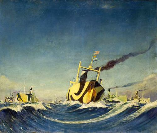
(image credit: nmm.ac.uk)
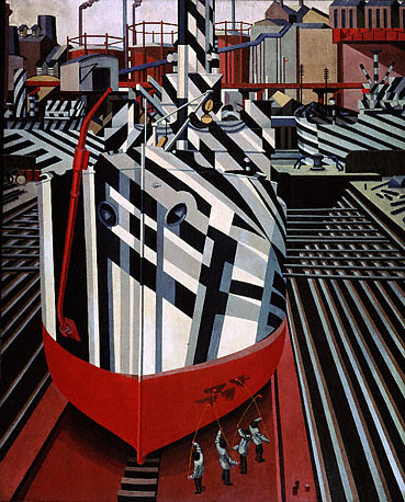
"Dazzle Ship in Drydock" by Edward Wadsworth, 1919:
Painting of HMS "Olympic", sister ship of the "Titanic", in its
wartime mufti by Arthur Lismer:

(image credit: julesverne.ca)
Another view of the "Olympic":
L. Campbell Taylor drew "Mauretania" with a checkerboard pattern:
(image credit: bobolinkbooks)
(image credit: Jim and Jamie Richter)
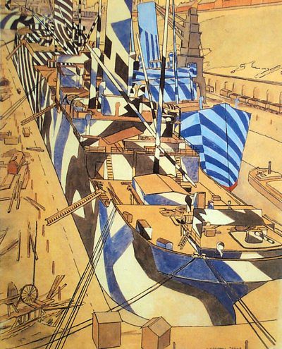
"Dockyard, Portsmouth" by J.D.Fergusson, 1918:

Dazzling Camo for Infantry

German Steel Helmet & Gloves, First World War
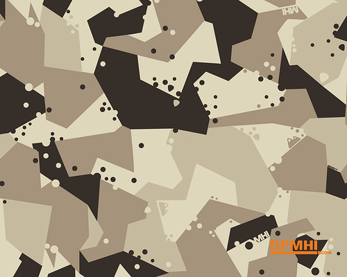
It's easy to mock the idea of Razzle Dazzle colorful outfits for soldiers during World War I. However, the digital camouflage used by many armies today seems to owe something to Dazzle's geometric schemes. Digital camo uses small micropatterns, as opposed to larger macropatterns – like drawings of trees or leafs. (more info here)
Dazzle has also had significant impact throughout the world of art.
Fiat Strada painted in dazzle design by Patricia van Lubeck, 1990:
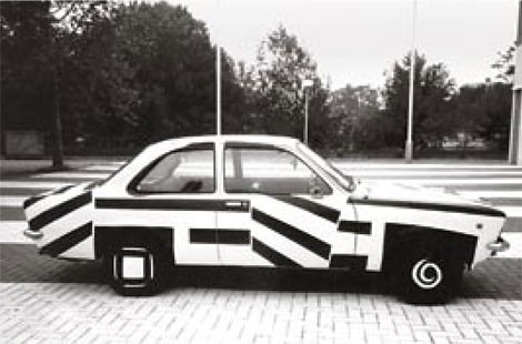
Courtesy DPM. Photo: Patricia van Lubeck
Graphic by Kenzo Minami:
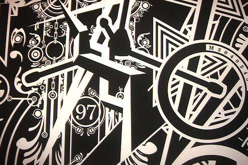
(image credit: John Prolly)
Military historians have usually connected Razzle Dazzle with cubism, which is patently wrong. It is quite clearly inspired by Vorticism, which is considered to be the only significant British art movement of the early 20th century. Started by Wyndham Lewis, editor of the short-lived "Blast" magazine, Vorticism was much more confrontational than Cubism.

(source: Wiki commons)
The Cubist was concerned with apples, guitars and life in the cafe. The Vorticist was not afraid of looking outside the cafe and observing the architecture which surrounded the cafe. Also, there was a hint of aggression, or conflict in most Vorticist works that is entirely missing in French work. Vorticist works are characterised by the unease created by a disrupted perspective. (more info here) Given that description which artistic theory would you rather use to cover your ship?
Postscript –
This was not the oddest attempt to disguise ships.
That honor goes to another Brit: Lord Mountbatten. In 1940 then Capt. Mountbatten was in charge of a convoy of ships. He noticed that one ship in the group disappeared from view earlier that the other ships. That ship was a Union Castle liner that was still wearing her pre-war hull color of medium lavender mauve grey.

Mountbatten thought this color would be particularly effective at dawn and dusk, often the times of greatest danger for ships. He had all destroyers in his flotilla painted in the color, which came to be known as Mountbatten pink. (more info here)
(image credit: James Dorrian)
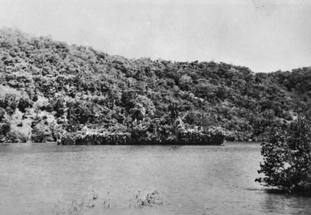
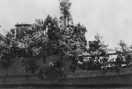
Ship disguised as a tropical island
A special kind of camouflage was employed by the Dutch warship Abraham Crijnssen. Originally built in 1936 as a minesweeper, this ship was stationed in the former Dutch East Indies in 1937. At the outbreak of the Second World War "Abraham Crijnssen" made its escape from the Japanese invading forces in a truly spectacular way.
Camouflaged as tropical island (!) the ship sailed between enemy lines to
Australia. From there the "Abraham Crijnssen" undertook patrol and convoy services until the end of the war.
(Source: Allies in Adversity, thanks Martijn Reneman)
REQUIRED READING: "The Great War and Modern Memory" by Paul Fussel.
The pre-eminent study of World War I and it's impact on the world's artistic vision. Superb.
All World War I photos on this page are from the museum catalog "Dazzle Painting, Kunst als Camouflage, Camouflage als Kunst", by Albert Roskam / Stichting kunstprojecten, 1987, public domain
Article by Constantine vonHoffman of "Collateral Damage" and Avi Abrams for Dark Roasted Blend.
(want to be our contributing writer? contact us, see guidelines here)
Permanent Link...


Category: Art,Military, Boats/Ships
Related Posts: Tank Bling!, Jets & Clouds Effects


0 comments:
Post a Comment