 "QUANTUM SHOT" #129
If the world was made out of rubber,
and would stretch according to the certain parameters...
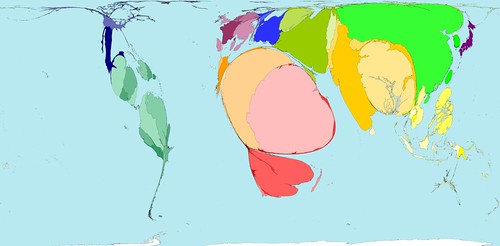
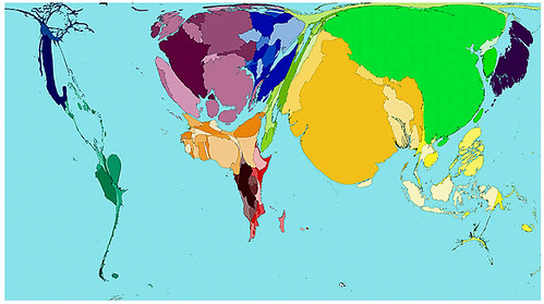
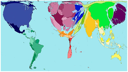
These computer-modified maps (or rather cartograms) were produced in an unique collaboration between two universities - project WorldMapper.
They show the world how it really is - with the countries either shrunk or blown out of proportion, depending on the chosen parameter. These maps are a great tool in the modern world trends analysis.
Visit the WorldMapper Project's page for other thought-provoking comparisons.
(click to enlarge all images)
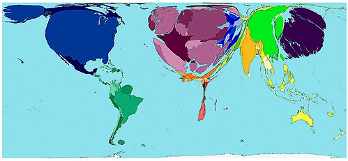
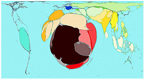
World's House Prices
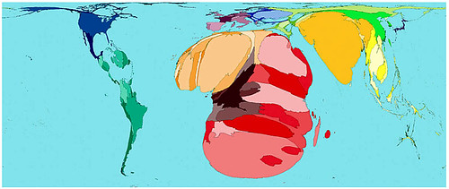
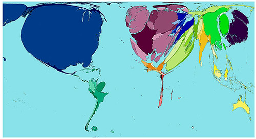
HIV (distribution by countries)
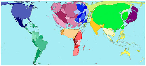
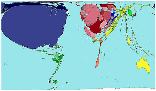
Alcohol Consumption
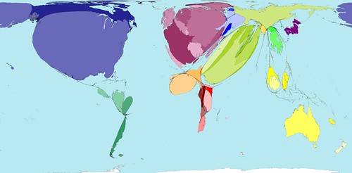
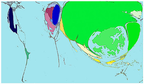
Immigration
War Deaths
Military Spending
Toy Imports
Toy Exports
Killed by Disasters
Wealth in the year 1500
Wealth in the year 2002
© Maps Copyright 2006 SASI Group (University of Sheffield) and Mark Newman
(University of Michigan). Used by permission.
Speaking of wealth...
Check "How wealthy are you?"
(compared with the rest of the world)
You may be richer than you think!
One such calculator is here;
the other is here
well, then -
Are you happy?
Find your country in this "World's Map of Happiness" and find out exactly how happy you should be :)
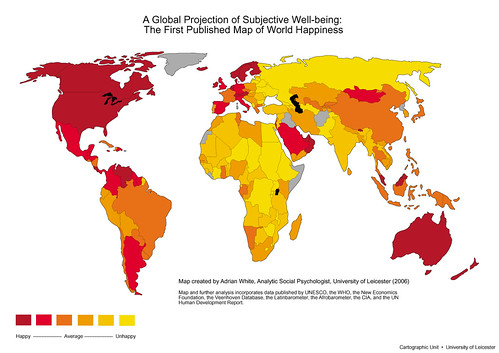
via FrogView
Ignorance is Bliss
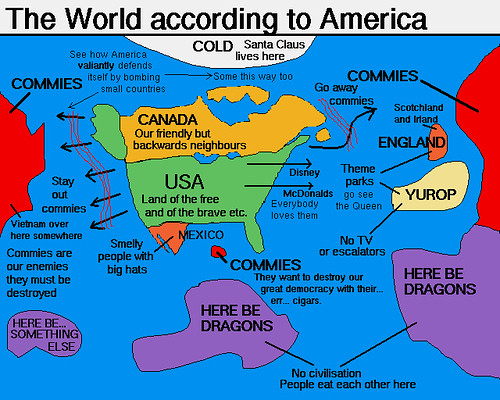
The following is a classic image, poking fun at the possible source of American happiness:
or zooming in...

other fun maps arehere
Alas, reality is way more complicated: for the mapped "World's Most Dangerous Destinations" and explanation of each, go to this page...
Sources: Cynical-C, Daily Mail
Permanent Link...

Category: Science,Travel


0 comments:
Post a Comment